
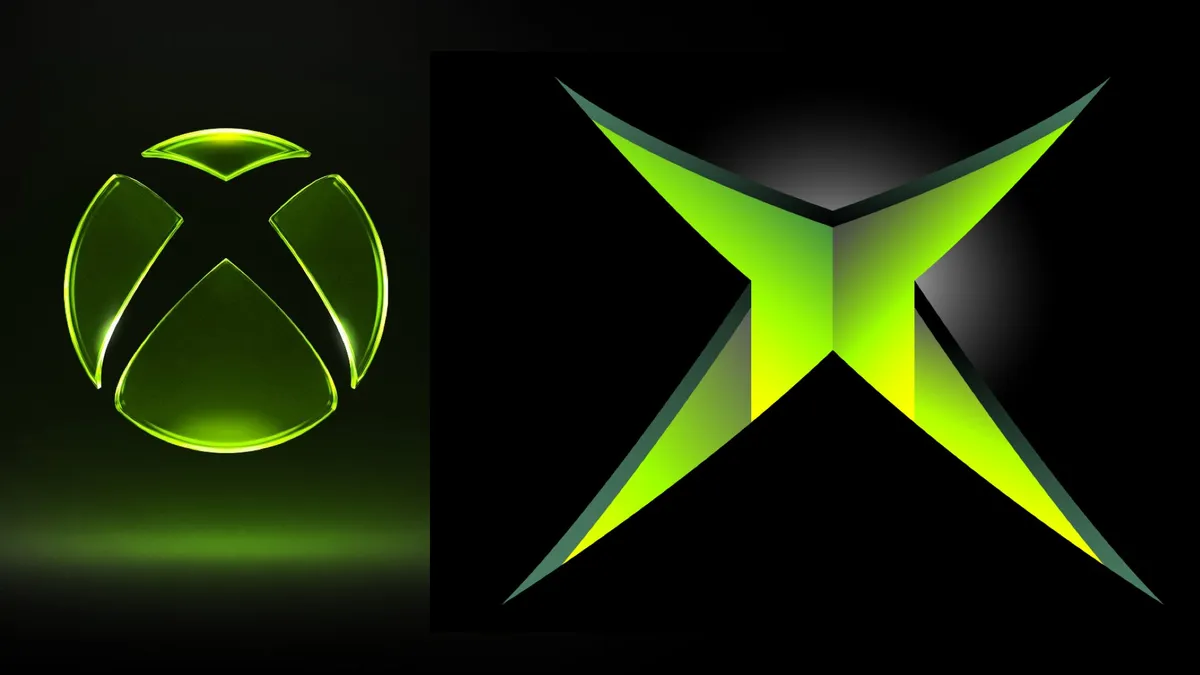
Xbox is out here pulling off a full nostalgia combo. According to Eurogamer, the newly redesigned Xbox logo is a deliberate throwback to the brand's iconic lurid green - the kind of green that screams 'original Xbox' and makes a certain generation of gamers feel things they haven't felt since the Halo 2 campaign.
This is all part of new Xbox CEO Asha Sharma's ongoing 'we can change' campaign, which kicked off following Phil Spencer's departure back in February. Sharma has been running what can only be described as a nostalgia-fueled hype reset, leaning hard into the console's glory days to try and win back fans who have been logging off from Team Green for a while now.
Respawning the brand
Think of it like a classic game remaster - same DNA, fresh coat of paint, hoping nobody remembers the rough patches in between. The logo refresh is the latest salvo in what appears to be a full brand overhaul, with Sharma's Xbox clearly betting that reconnecting with its roots is the key to unlocking a new chapter.
Whether this is enough to bring lapsed Xbox fans back into the fold remains to be seen. A logo change is a cosmetic buff at best - the real question is whether the gameplay changes (read: actual games and platform direction) are coming down the pipeline to back it up.
The glow-up nobody asked for but everyone needed?
Look, nobody has ever lost sleep over a shade of green before, but this feels like more than just a rebrand for the sake of it. Sharma's Xbox seems to be signaling loud and clear that they know what made the brand special, and they want that energy back in the building.
It's a bold move in what has been a genuinely turbulent era for Xbox. Now if only they could respawn some of those classic Xbox exclusives with the same energy, we might really be onto something.