
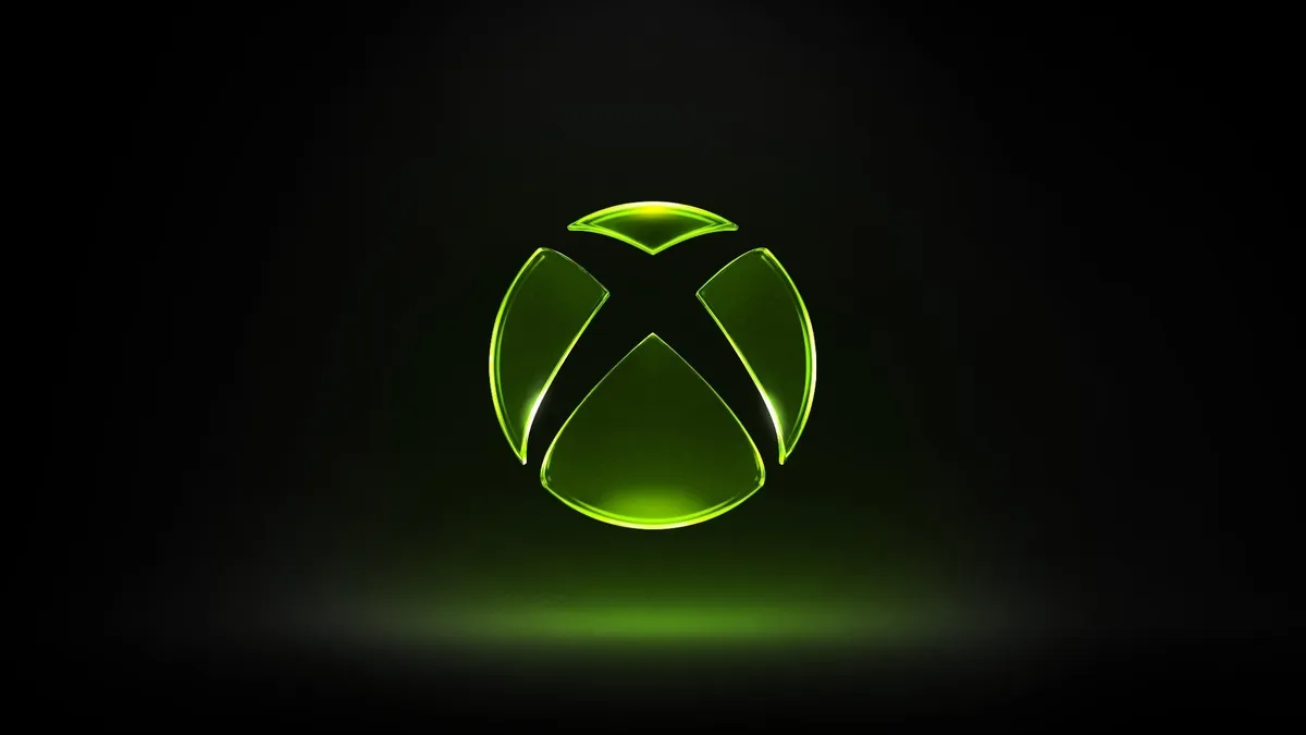
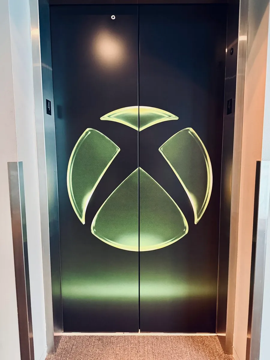
Xbox has officially unveiled a new logo, dropping it alongside what Pure Xbox describes as a 'massive statement on the future of the brand.' The official Xbox account on X/Twitter posted a 4K version of the new design with the accompanying message 'we are Xbox,' signaling this is more than a minor refresh.
The new logo represents a notable visual shift. While Xbox has historically swapped the color palette of its iconic sphere mark fairly regularly, this iteration is being positioned as the definitive look for the brand's next chapter - and by all accounts it's a significant departure from what fans are used to seeing.
A new era for Xbox identity
Xbox branding changes are nothing new, but the timing here is deliberate. Pairing a logo reveal with a broader statement about the company's direction suggests Microsoft wants the visual identity to carry some weight as it charts its path forward in the console and PC gaming space.
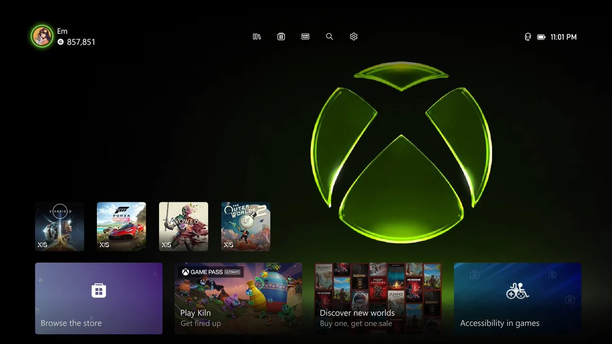
For Series X and Series S owners, there's also a practical upside - Xbox has shared instructions on how to set the new logo as your console background, letting players rep the updated look directly from their home screen. It's a small touch, but it's the kind of community engagement that goes a long way.
Whether the new logo lands with the fanbase remains to be seen, but the boldness of the redesign makes it clear Xbox isn't playing it safe. As the platform continues to evolve - with Game Pass, cloud gaming, and multiplatform releases all reshaping what 'Xbox' even means in 2026 - a fresh visual identity feels fitting.